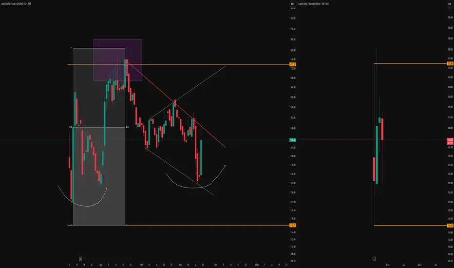
-Green Broadening Pattern
A distinct broadening pattern is forming, mapped out by the green lines on the daily chart. This structure highlights expanding volatility, which often captures both swing highs and lows as price oscillates between opposing boundaries.
-Monthly High-Low Anchors
The orange horizontal lines represent the high and low of the first monthly candle, visible on the right—these serve as crucial long-term reference levels.
-Purple Box and Monthly Supply Manipulation
Up near the orange monthly resistance, the purple box marks a period of price interaction and ‘manipulation’ around the top supply. This box encapsulates a classic area where aggressive sellers and liquidity seekers converge, sometimes engineering fakeouts or squeezes before the real direction is chosen.
-Equilibrium and Rounded Higher Lows
Within the broadening pattern, a clear equilibrium zone is formed (represented by the midline drawn through the structure). This acts as a median for price oscillations and often becomes a pivot for both upward and downward moves. The two semi-circular white arcs on the left chart illustrate the emergence of higher lows
-Context from Monthly Timeframe
On the right, the monthly chart remains essential for framing all of the above
This analysis is solely observational and intended for educational purposes. No forecasts or trade signals are provided. Please exercise full discretion and undertake your own due diligence before making any trading decisions.
🎯 Master My Self-Made Trading Strategy
📈 Telegram (Learn Today): t.me/hashtaghammer
✅ WhatsApp (Learn Today): wa.me/919455664601
📈 Telegram (Learn Today): t.me/hashtaghammer
✅ WhatsApp (Learn Today): wa.me/919455664601
관련 발행물
면책사항
해당 정보와 게시물은 금융, 투자, 트레이딩 또는 기타 유형의 조언이나 권장 사항으로 간주되지 않으며, 트레이딩뷰에서 제공하거나 보증하는 것이 아닙니다. 자세한 내용은 이용 약관을 참조하세요.